# Widgets
# What widget types are available in Vantage?
### **Overview**
Vantage dashboards are built from widgets — the individual charts, tables, maps, and text blocks you add to a dashboard. Vantage currently offers 14 widget types, grouped into a few families.
### **When to Use**
Use this page when:
- You're deciding which widget fits the data you want to show
- You want to see every widget type at a glance before building a dashboard
- You're new to Vantage and want to know what's available
### **Concepts**
1. **KPI Card** – A single large number, often with a trend arrow, for one metric you want to highlight at a glance — for example, total submissions or completion rate
2. **Chart** – Shows data as a bar, line, donut, pie, combo, or 100% stacked bar — good for trends over time or comparing categories
3. **Summary Table** – A plain table that groups and totals your data by the fields you choose, like a breakdown by region or product
4. **Pivot Table** – A table that cross-tabs two fields against each other, so you can compare two dimensions at once — for example, region vs. month
5. **Geo Map** – Plots your data on a map by location — useful for store-, region-, or country-level views
6. **Calendar** – Lays your data out across the days of a month — useful for spotting daily patterns or gaps
7. **Media Analysis** – Shows the results of AI checks run on submitted photos, such as a Yes/No check or an extracted value (two versions exist, v1 and v2)
8. **AI Summary** – A short, AI-written text summary of your data — a quick narrative instead of numbers or charts
9. **Title Block** – A text or heading block that labels a section of a dashboard — it doesn't show any data itself

### **Set Up Guide**
Before You Start: Vantage is accessed inside Bsharp Converse through the Custom Widget on the Home Page — there's no separate Vantage app. If you haven't set this up yet, see How do I use the Custom Widget? first.
1. Go to a dashboard and click Add Widget
2. Vantage shows all 14 widget types in a grid — browse them here before deciding what to add
3. Each widget type has its own setup page later in this book, with the exact fields and options for that type
### **Best Practices**
- Pick the widget type based on what you want to show, not how it looks — a KPI Card for one number, a table for a full breakdown, a chart for trends or comparisons
- Use Title Block to label sections if your dashboard combines widgets from different topics
- If you're not sure which chart type fits, start with a bar or line chart — they're the easiest to read
### **Related Links/FAQs**
Related pages in this book:
- How do I configure a KPI card widget?
- How do I configure a chart widget?
- How do I configure a summary table or pivot table widget?
- How do I configure a geo map widget?
- How do I configure a calendar widget?
- How do I configure a media analysis widget?
- How do I configure an AI summary widget?
##### FAQs
**How many widget types does Vantage have?**
14, grouped into KPI cards, charts, tables, maps, calendar, media analysis, AI summary, and title blocks.
**Can I change a widget's type after I've added it?**
Yes — after you change the type, you'll need to configure it again to match the newly selected type.
**What's a Title Block for?**
It's a text block you can drop onto a dashboard to label a section — it doesn't show any data itself.
### **Version Notes**
Last Updated: Oct 2026
# How do I configure a KPI card widget?
### **Overview**
Configuring a KPI card widget shows one key number on your dashboard, with an optional comparison to a previous period so you can see whether it's trending up or down.
### **When to Use**
Use this feature when:
- You want to highlight a single key metric, like total submissions or completion rate
- You want to show whether a number has gone up or down compared to a previous period
- You need a custom calculation that a simple count, sum, or average can't do
### **Concepts**
- KPI Card – A widget that shows one number, usually with a label and a trend arrow
- Source Field – The field whose values the KPI calculates — for example, submission count
- Aggregation – How a field's values are combined into one number, such as Sum, Count, or Average
- Compare Period – An optional second time period the KPI compares against, to show a trend
- Custom Formula – A manually written calculation, used when the built-in aggregations aren't enough
### **Set Up Guide**
1. Go to a dashboard and click Add Widget
2. Select KPI Card
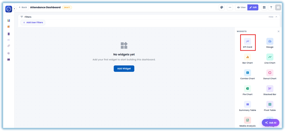
3. Choose the source — if the dashboard has only one source, it's selected automatically; if there are multiple sources or a relationship, choose which one to use
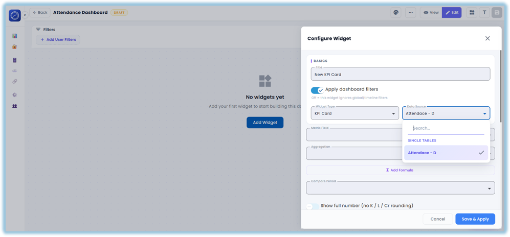
4. Build the KPI in one of two ways:
- Select one field and choose the aggregation (Sum, Count, Average, etc.)
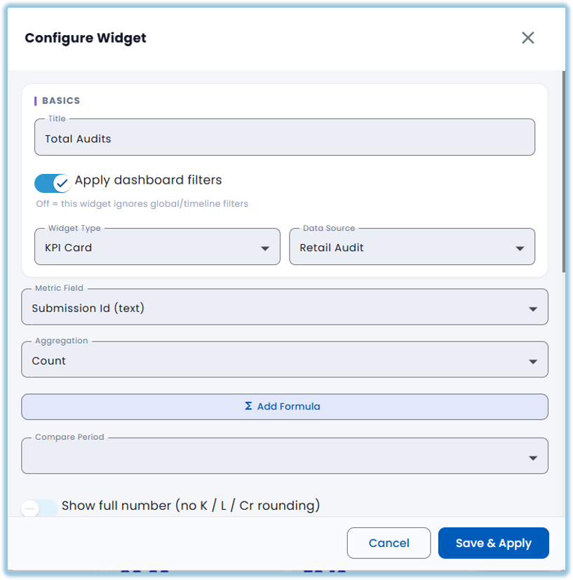
- Or write a custom formula instead
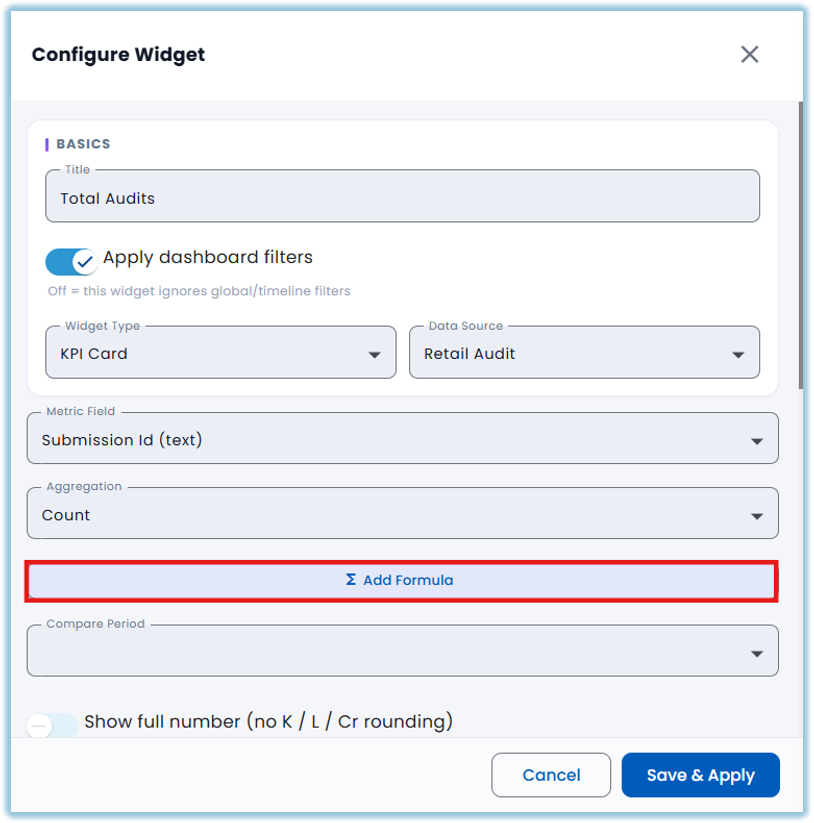
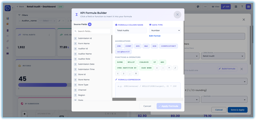
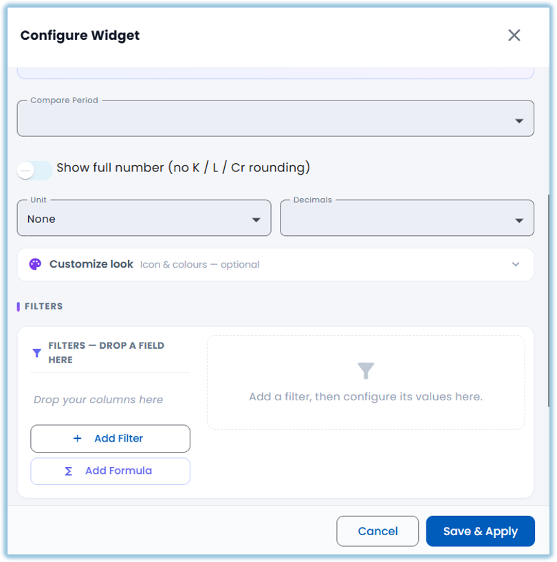
5. Turn on Compare Period if you want to show change vs. a previous period, and pick that period
6. Apply any filters you want the KPI to respect
7. Click Save
### **Best Practices**
- Use Compare Period when the trend matters more than the raw number
- Only use Custom Formula when Sum, Count, or Average can't do what you need — it's harder to maintain
- Keep the KPI's label short so it's easy to read at a glance
### **Related Links/FAQs**
Related pages in this book:
- What widget types are available in Vantage?
- How do I configure a chart widget?
##### FAQs
**Can a KPI card use a custom formula?**
Yes — if the built-in aggregations (Sum, Count, Average) don't cover what you need, you can write your own formula.
**Does the KPI card show a trend automatically?**
Only if you turn on Compare Period and pick a period to compare against.
**Can I combine data from two sources in one KPI card?**
Yes — but you need a Relationship defined between the sources first.
### **Version Notes**
Last Updated: Oct 2026
# How do I configure a chart widget? (Bar, Line, Donut, Pie, Combo, Stacked)